Publication to blog and analysis
Create a blogpost called 'Magazine practical task evaluation' and complete the following tasks:
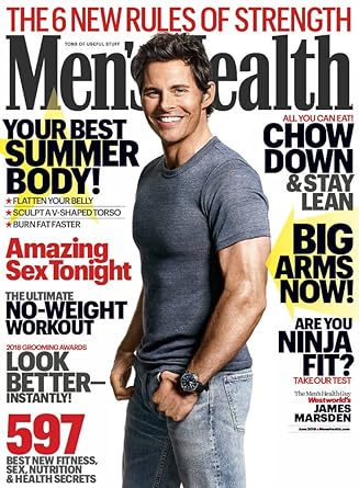
1) Save your finished Photoshop magazine cover as a JPEG image and upload it to your evaluation blogpost.
2) Write an evaluation of your work: have you succeeded in your brief to create a new, original edition of an existing magazine?
One thing that i would change about this poster is that I would make it a little bit more professional in the way that there would be more pictures and more facts as I feel like i could add more facts. Also I would add more colour in the back and more information on the screen just to make it stand out a little bit more.


4) What is the strongest aspect of your work?
The strongest aspect of my work i believe is The sidelines because although they don't look as professional as they should they still make the magazine come to life and stand out.
5) What is the weakest aspect of your Photoshop magazine cover?
I believe that the weakest aspect of my Magazine would probably be the Men's health logo because it is what really makes the magazine not look professional I should have made it larger.
6) What would you do differently if you completed this assignment again?
If i could do this differently i would make the taglines bigger and Bolder and i would also fill the page out more so that it looks more like the other magazines.

No comments:
Post a Comment